One of the most frequent questions I get is ”What’s the best way to visualise existing content?”.
Communications professionals frequently “produce” content for different audiences and they spend a lot of time drafting it!
I intentionally used the term “produce”. Most of the time the outcome is just another PDF. Nothing more. No story and no messages. Poor or non-existent visuals. What’s worse: only then does the realisation that this content is “dry”, “too long”, “too technical”, “only for our members”, etc., start to hit home, and that’s unfortunate!
Why? Because it’s 2022 and publishing just another PDF will not get you far.
Except for some of your members and colleagues – who will read it?
Is your content intended to reach EU influencers and decision-makers? That will not happen. Over time, lousy content will push your readers away.
What are your options?
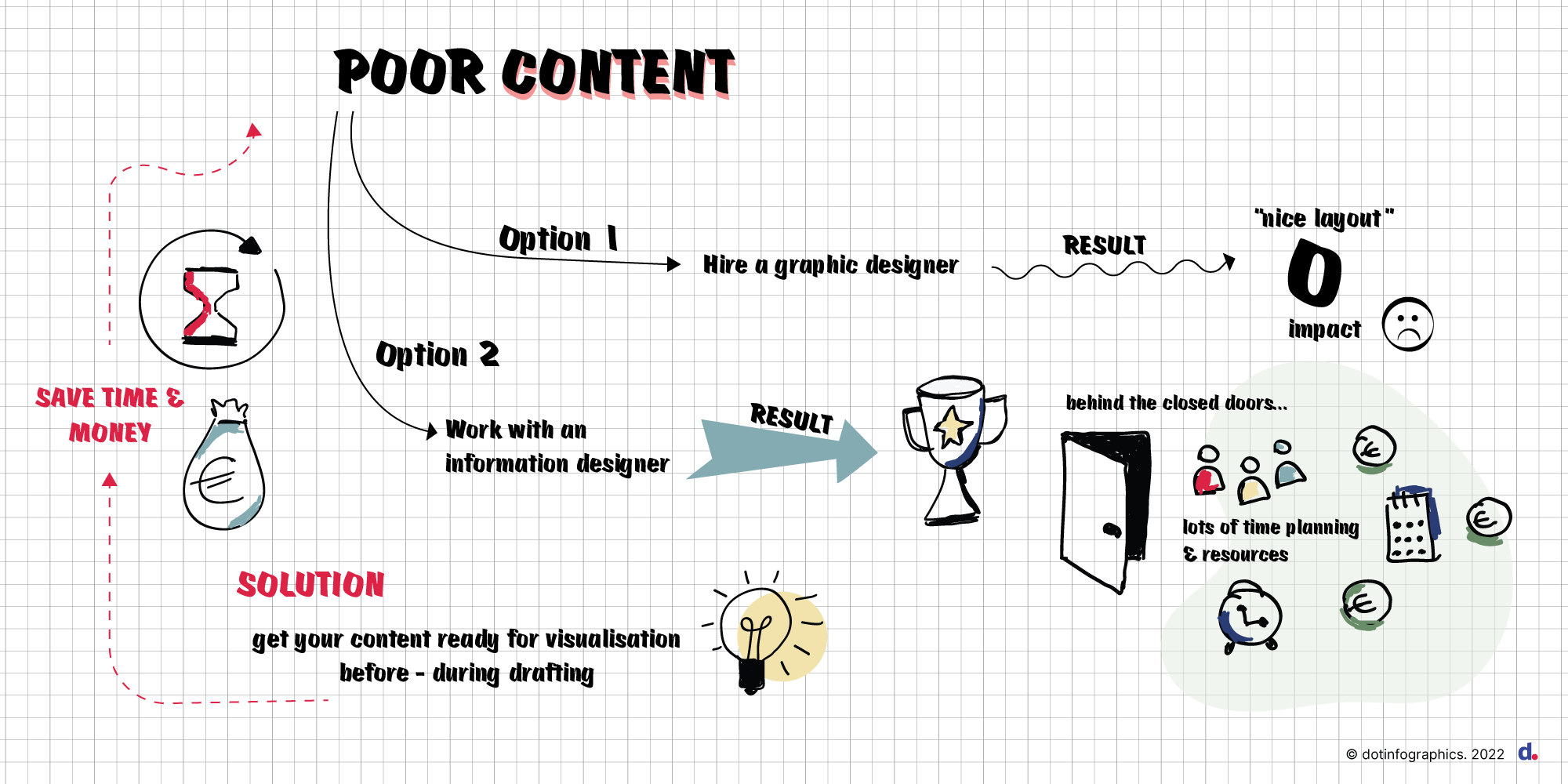
You are left with two:
- Hire a graphic designer to add stock images to make the PDF “a little bit nicer” which = zero impact or
- Work with a professional to restart the process which means = the need for a healthy budget + more time and + skilled people.
Unless you have a huge budget, none of these options work.
So, it pretty much feels like learning to run before you walk.
What is the solution?
How about you get your content ready for visualisation?
Here are four top tips to support your creative person while saving some time & money:
1. Your content has a purpose and a real answer to the question “why”
I see publications that bring no value. I also see GREAT publications that have no content strategy behind them: a missed opportunity to amplify impact.
I also see GREAT + HIGHLY VISUAL publications that would have been more effective as visuals for key social media messages.
Most people complain (and for good reason!) about receiving emails with LONG publications. Could you fit your story into 2 pages? Perhaps an A4 infographic does the job instead.
In 9 out of 10 cases many professionals think content = publication.
How about you ask yourself two simple questions:
- Q1. Why do we need a publication?
Brainstorm about the intended impact or outcome. Perhaps your objective is to inform, create awareness, influence, explain, etc. Whatever the reason – have a real purpose. Then create something original for your audience.
- Q2. Do we REALLY need a publication or is another format more appropriate?
2. Your content adapts for interactive or digital access
Once you have established the format it’s time to think about access.
How will your audience access the content? The content should be available on multiple devices and the reader should be able to easily interact with it.
Knowledge of your target audience is important. Being familiar with your audience’s content consumption should provide the right guidance.
If you plan to partner with an information designer to visualise your story, now’s the time to ask for advice on technicalities and a budget estimate.
It is essential that you have a clear idea on whether your content will allow for interactivity, and how and where it will be available. Content drafted primarily for print is not the same as content for an interactive infographic or a digital publication. Once you understand these differences, you can deliver a highly enjoyable experience to your audience.
3. Your content has the right foundation: STORY – STRUCTURE – KEY MESSAGES
We are not all storytellers. That’s perfectly fine. My motto is what I call the golden triangle: story – structure – key messages. It should be the foundation of your publication or any communication material for that matter.
Everything around it – both content and visuals – is based on it.
Get the right Story, not just any story
Great content is based on great stories. Great stories help with visualisation. Write content that people want to read. Put yourself in your audience’s shoes. Would you read it if you were them?
Would you share it on social media?
Avoid stories that sound too good to be true. You lose trust and credibility.
The worst publications I see are Annual Reports. Mainly for 2 reasons:
- Organisations feel compelled to write about EVERYTHING accomplished during the previous year. It’s a way to justify their time and budget to their members.
- Stories are overhyped. You know the type -“we are the best and last year we were the greatest. Join us, we are the smartest”.
Structure everything
Your story should have a beginning and an end. It should flow from one idea to another. Everything should be linked together.
Your audience might not follow the story from the beginning. Be aware of that. Don’t lose them before they even start reading. Avoid long chapters and complicated structures with subchapters.
If you have an intro – have a conclusion.
End with an answer to the question “What’s next?” or a call-to-action (CTA).
Identify or include key messages
Key messages and keywords are essential to delivering a credible story. Visually, it helps the reader navigate through your story.
The audience will mostly remember this type of content more than others. Spend the appropriate amount of time in identifying key takeaways for your audience.
Think like a journalist: is this message relevant? Does this message make me want to do something about this topic? Does it leave me indifferent?
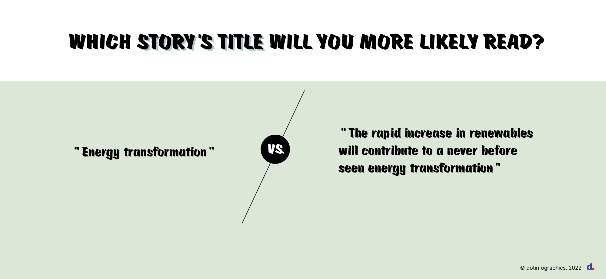
One of the most common mistakes I see are dull and uninspiring subtitles. Avoid using bland statements.
Similar examples of powerful content could include: testimonials from members, quotes from decision-makers and short success stories.
This is rich content that will immerse your clients into your stories.
4. Your content uses the right charts to visualise data
When it comes to data visualisation, two areas are important: data reliability and accuracy.
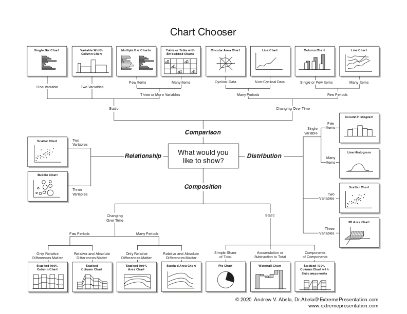
It is important to always check the source of your raw data. If you use external data, ask for copyright use well in advance. Question whether you are using the right chart to visualise your data?
I cringe every time I see a pie chart that does not add up to 100% or incorrect use of a bar chart instead of a line chart. Work together with an information designer to help tell a story with data and visualise it correctly.
The main takeaway
You don’t have to be a storyteller to draft content that becomes a great story.
The most effective communication materials I came across were based on a strong foundation. The whole visualisation process was fun and creative.
And who does not want to share a visual story that resonates with its audiences?

Hi there! I am Alisa De Backer and I am helping public affairs organisations create and visualise content that raises awareness, inspires and motivates into action. I have been working with and for trade associations, NGOs, private companies, and EU institutions for the last +15 years. During this period, I delivered successful visual communications campaigns for +30 sectors. In this blog I am sharing insights, know-how and best practices that I have acquired during my experience.
